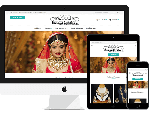
We are designing and developing a Responsive website in the best way that will respond easily to the users’ devices and screen size. Responsive web designing is a special way that can make a dynamically change in a website when it can appearances on mobile or desktop. Our Responsive web design approach is to develop to provide the best view experience of reading and navigation with a very short resizing, panning and scrolling on the different types of devices. Responsive web design uses the breakpoints that are used to determine how the website layout appears. The breakpoints are based on the width of the browser.
Mobile-friendly websites recognized by most of the search engines as a strong ranking. On optimizing the websites on the tablets, mobile phones and PC’s that attract the most traffic on the websites. When the website will construct through the aim of Responsive web design it will offer the Aesthetics, convince, user-friendly.
Now, why you are waiting to just make your website fully future proof with all device responsive layouts.
Contact our expert to grow your business and save time with seamless experience.
+91 8210081640
info@hymsoftware.com
live:ajitk806